A bUNDLE OF thousands of dollars worth of courses, guides, & resources curated specifically to help photographers!!!
ENTER HERE >>>
DOORS OPEN MONDAY MARCH 4TH!!!
THE
CREATIVE
COLLABORATION
Lexi Critiques – Kati
October 8, 2019
Yay! You made it! Welcome to our very first Lexi Critiques!
I am beyond excited to start this little bi-monthly series and give you a place to pick up yet more education to grow. And in case you haven’t heard, Lexi Critiques is where I will be looking at a real session from a real photographer in our industry and pointing out strengths and leaving tips that would have made the session stronger. Over the last 7 years I have seen hundreds, if not thousands, of sessions from being a publisher and running my own photography business. I have learned a lot about what makes a session stand out among the rest. And I am here to help you achieve that!
Today we have the lovely Kati Mallory who was brave enough to allow me to critique her session for our first go around. (Hi Kati!!) Kati is a joyful fine-art photographer based in Little Rock, Arkansas. Since becoming a full-time photographer in early 2014, she has become known for her dreamy warm images capturing people on their happiest days. She is a lover of warm sunshine, hand-written notes, and belly laughs.
So with out further adieu go grab a pen and paper (for notes) and dive on in below.
* Keep in mind this is a little series and I will not be showing the full gallery that was provided. Each post will include a handful of tips and tricks but know there is a lot more that goes into perfecting a session. I hope these posts help you reach this goal and you are more then welcome (encouraged even) to leave questions in the comments below.

When starting out a session you should establish right away what the session, or your story, is about. I love how Kati started this gallery out with an image of the whole family. This shows me, and establishes, that this is a family session.

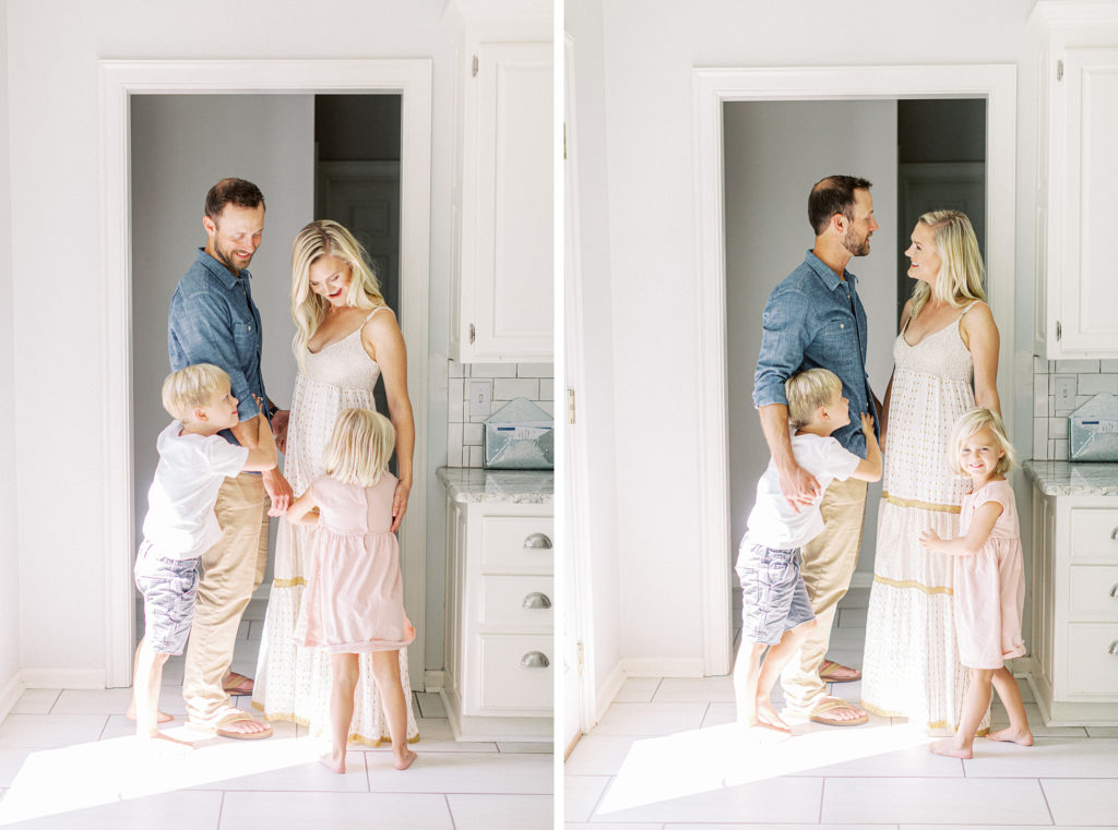
Variety and flow is something that I see a lot of photographers struggling with when it comes to their galleries. Especially with family sessions. I love how Kati nailed both here with this little series she set up (there were more in her full gallery). Not only does this little set of images add variety to the gallery but it also adds emotion and movement to the story line, which in turn pulls the viewer further in.


The series above is a super sweet one and the second location Kati used for this session. I would have loved to see more images of the family in the doorway (the first few images) though before moving on to this set up. All your images should flow together like a story. So think of your specific locations like chapters. You need to fully tell each chapter and give it depth before moving on to the next.
As I mentioned above I love this little set up. The interaction and depth in the images are great. But .. we could have taken it a step further. In our guide “Shooting With Intention“ I talk about the five portrait shots you should be capturing at every session, and really at every location. And with these sets of images I am only seeing two of the five types of portraits. This set of images is a great example of how you can create a stunning gallery with just two types of portraits. But imagine how much stronger it would have been with a little more diversity with five types mixed in vs. just two.

And lastly I’m going to leave you with this.
All the tips I give are ways to elevate your session and create a stronger story. Will they work for every session … no. Kati’s session was stunning and I know her client will have beautiful heirlooms from it to enjoy for generations to come. But does that mean we shouldn’t stop striving to perfect our craft more? Of course not.
I hope you enjoyed this weeks Lexi Critiques and if you’re ever interested in submitting a session for consideration you can find all the details HERE. Until next time .. happy shooting!