THE ARTE OF COLLABORATION
join the waitlist
A curated library for photographers shaping intentional, refined work
THE
LUMIÈRE
COLLECTIVE

Color Theory
October 25, 2022
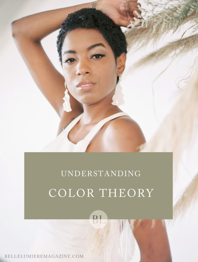
It’s more than an after-thought or a favorite nail polish shade. It’s more than all those fun sample sheets at Lowe’s and Home Depot. It’s more than a personal aesthetic or even a cool Pantone swatch-color is everywhere. Color is a fundamental building block in the world of visual art and one of the very foundations of the principles and elements of design. Without it, we would have no concept of mood, temperature, tone or emotion. Color is key to all visual art-and photography is no exception! Let’s brush off the cobwebs on an elementary understanding of color and get ready because I broke out the graduate school textbooks for this guys!
But before we delve deep into the wonderful world of color, I want to start by providing a brief overview of basic definitions that will provide crucial background for these lovely hues.
Color (or otherwise known as “hue” in basic color theory terms) can be defined according to Design Basics by David Lauer and Stephen Pentak, as “the visual sensation of the different parts of the color spectrum”. But what is even more fascinating about color is the fact that in order to make sense of it- we must understand it in terms of light. Why? Because light is the source of all color. In scientific terms, the reason we can comprehend a color is because based on its specific wavelength in light, our brain registers the frequency through our sense of sight- and voila! – a color is born.
Within this realm of light, artists have come to organize colors based on the oh-so-familiar color wheel- which, in short, is a diagram organizing all colors on the ROYGYBV spectrum. Using this, we break all major color schemes into categories according to their location and relationship to neighboring colors on the wheel. These categories make up important palettes such as primary, complementary, tertiary, warm, cool, analogous, shades, tones, tints and so on.
But how does all this information apply to photography? Well, as photographers we document the people and world around us, and the world around us is shrouded in light- lovely light- which we study to harness, capture and create stories with. That light is the source for all color, and that color paints our lives! By it, we learn to see, express, create, and communicate. Without it, this world would just be a myriad of ugly grays. Bleh. You see, color can’t be separated from our work as photographers. Therefore, it is crucial to understand its details and how it works. Through the two example shoots below, my desire is to help educate you on the basics of how color can be used in our line of work. I wholeheartedly believe that a more thorough awareness of the power of color will better enhance your images to reach their fullest color potential! So, with all that said, let’s dive in!
Everything has a relationship with color. More importantly, colors have a relationship with each other. Learning how to use these color relationships in your work will help you to communicate the exact message you strive for in your images.
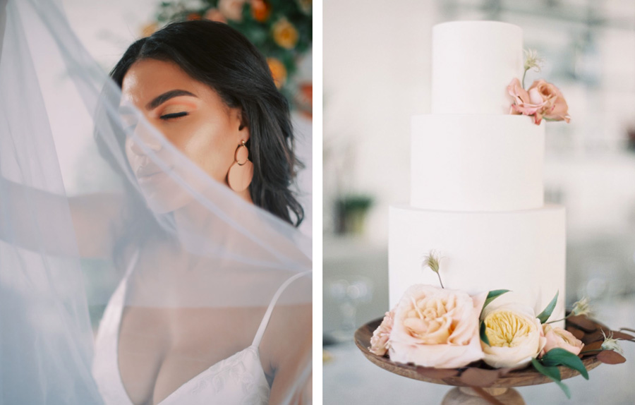
For this first shoot, I chose a complementary color palette. Complementary colors are any color pair that are opposite each other on the color wheel. For example: red and green, blue and orange, yellow and violet. In the shoot below, I chose a smoky blue and paired it with its compliment, a beautiful burnt orange. Complements are perfect opposites and the reason for this is because of their opposing positions on the color wheel. Complimentary colors contain the maximum amount of visual contrast by being paired together. There is no blue in orange, and no orange in blue. They are perfect opposites- and as a result, that pairing caused my colors to vibrantly pop in these images. The orange seems more brightly orange and the blues seem more deeply blue because of their working together. However, just because I chose a complementary color pairing doesn’t mean that colors can always end up looking harmonious in a photo. I’m sure we all know that there are different versions of each color- just go to a paint shop and notice just how many whites there are! Therefore, achieving color unity requires another step in your color theory knowledge.
The main way that this color unity is achieved is through tone and temperature. Temperature refers to the color leaning warm or cool. Tones, tints and shades refer to the color’s value. Colors that have been mixed with black create shades, colors that have been mixed with white create tints, and colors that have been mixed with gray create tones. Black, white and gray all affect the colors value- or in other words- it’s lightness or darkness. The reason this pertains to color unity is because colors that have the same temperature, tone, tint or shade are going to be visually harmonious. Our eyes are keen to noticing when something is out of place in a scene, so knowing how to achieve color harmony can boost the quality of your photos. A great example of color harmony can be found in an analogous or monochromatic color scheme. Hence, this leads us to the second set of example photos- a monochromatic shoot!
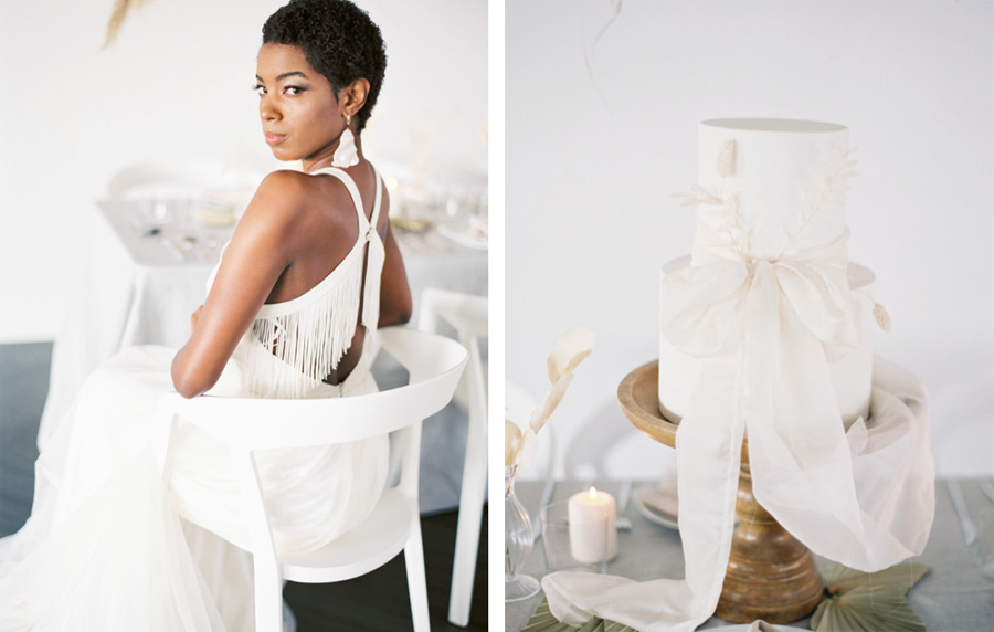
A monochromatic color scheme is when all of the colors in a set are related to one another. They are all either tints or shades of the same parent color- or- they are all separate hues that each contain a little bit of the other hue in them. Analogous colors are any set of three colors next to each other on the color wheel, with one opposing tertiary color. Analogous palettes are often used to create monochromatic looks. Tertiary colors are the colors that are created when a primary and a secondary color get together, so for example: red-orange, blue-green, yellow-orange, and so on. When a tertiary color is paired with three other colors that are neighbors on the color wheel, an analogous palette is made. These analogous colors can then be used to create a monochromatic color scheme. For this shoot, there was no way for me to ensure that I would get the flowers, dresses, jewelry, shoes and other details in the exact same parent color- so- I chose an analogous color scheme to help me achieve a monochromatic look.
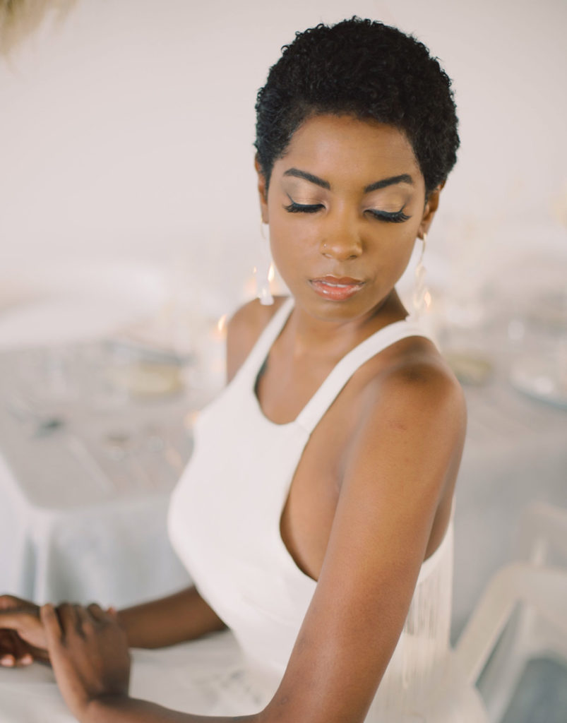
For the monochromatic shoot, I chose a very muted champagne and ivory color for my parent hues. Soft touches of gold and taupe kept the color temperature definitely leaning warm, and much like with the complementary shoot- I carefully selected elements that had the same undertones. This kept the palette soft, muted and monochromatic- with all different tints of champagne and ivory- while also remaining consistent with the tone of the palette. The overall feel was a soft, whimsical, and elevated scene. Knowing that my color palette would communicate a more sophisticated feel, I chose florals, a dress, stationery and linens that would all help to echo my desired mood.
Whelp- hopefully so far you have learned quite a bit about colors and some of the science behind them. If so, props to you for keeping up! I know all of this is a lot of information- but by better under- standing the rules of color theory, you’ll only discover how to appropriately break and experiment with those rules- meaning, the possibilities are endless! Clearly complementary, tertiary, analogous, and monochromatic schemes give us loads of options within our work. Likewise, understanding color harmony allows us to still achieve a unified palette no matter how you may mix or match your colors. Don’t think I forgot about the real reason you’re here though- your photos! They are definitely the second piece to this puzzle.
now that you have some basic color theory knowledge, how can this affect you as a photographer? Well, simply put, it can affect every thing you let it! Mood, style, light, emotion, movement- all of these aspects that make up a gorgeous photo can be enhanced or extended by a smart use of color. In the case of complementary colors as demonstrated in the photos of our first shoot- I chose a blue and orange pairing because I knew the contrast complementary colors create would cause both of those colors to come forward in my images, and hence, create a more dynamic and energetic shot. The color contrast would catch the eye, and each color would seem much richer next to the other due to them being complements. However, to keep my colors unified, I choose a smoky blue, paired with a cooler orange that would have a similar tone. This kept my color palette harmonious while also allowing for the complementary colors to do their thing and create that visual interest I wanted. Although- the wild floral headpiece definitely helped!
The model’s bright blue dress acted as my statement piece for the shoot- what and all with it being a lovely hand-painted silk. I understood that the tone of the blue in the dress had more cool and gray undertones, and therefore, I needed to choose an orange that was of a similar tone (more of a cool orange than a warm one). Even in the case of the more vibrant corals and deep mustards in the palette, I was still able to keep them unified due to the cool orange undertones they contained as well. Likewise, the grays of the stationary suite had strong blue undertones which helped in their role of bringing us back to the main smoky, steel-gray blue of the dress. By being intentional about my main color’s tones, I maintained harmony within the other various elements of the shoot while also carrying out a high-contrast and energetic scheme. The result: a spritely and vibrant styled shoot with bold energy and a bright feel.
But wait! What about using color for a more minimal and soft approach? I’m glad you asked! Just like color was used to generate energy and vibrancy in the complementary shoot, I also demonstrated the possibility of using it to evoke the opposite effect through the monochromatic shoot. not only can colors set a mood, but that style can also be carried out through shapes, textures, lighting, and so on. The fluffy pampas grass, bleached florals, organic cotton and even vellum wax seals, all corresponded with the textures that my use of this muted monochromatic scheme implied. The result- a gorgeous and harmonious scene. Both shoots- a vibrant complementary scene and a soft monochromatic scene- were made possible by the intentional use of color.
As photographers, light is our best friend. But my hope is that through this overview in color theory we can lean into the other valuable elements of design that work together to create something magical. We all know that lighting can completely affect the mood or style of a photo-but as can color! When the two work in tandem, the possibilities are truly limitless. Warm colors come forward, demand attention and evoke energy- like broad sun flare or a spunky red metro sign. But when we stage those same warm colors in a certain way, they can also be cozy, intimate and ambient- like a romantic candlelight dinner. Likewise, cool colors recreating moody, dark and mysterious scenes. But they can also be soft, refreshing and serene- like a delicate fog after a rain shower. Much like light, how you manipulate, stage and use color in your work can help become an extension of the style you seek for your images.
A more contrasting and bold color palette called for brighter light, bolder elements in florals, and interesting angles in regard to the complementary shoot. On the other hand, the monochromatic shoot had a very different feel. The similarity in color caused the scene to recede, allowing for a more soft, airy and delicate feel. If you can recognize these moods by looking at the photos, I blame the color! It is carrying the message I hoped to achieve by being intentionally applied to the various elements that go into a styled shoot.
Hopefully you are picking up on a pattern: colors communicate on our behalf. Color helps us express, communicate, and feel. Some- times, we are so used to focusing on light as photographers, that we often take colors and their power for granted. If you have gathered anything from this segment at all, please let it be this: light and color cannot be separated from one another, so we as artists have a great need to become fluent in the language of color.
In the wise words of color experts Joann and Arielle Eckstut, “Anyone who claims to be an expert on color is a liar. A true expert would have to be fluent in physics, chemistry, astronomy, optics, neuroscience, geology, botany, zoology, human biology, linguistics, sociology, anthropology, art history and cartography; and the list goes on and on…the vast majority of information we process from the outside world is visual. And everything we see is colored.”
Be mindful of color and watch and see how much your images begin to come to life. Happy coloring, Lumies!

Sarah Casmass has been observing the world through a lens since her parents bought her first Canon point-and-shoot camera in sixth grade. After receiving her BA in Studio & Digital art and her MFA in Photography & Graphic Design, she went on to become an Adobe Award-winning designer and hybrid photographer. She especially seeks the moments of simple, organic, and light-drenched love. A native new Yorker, Sarah moved coast to coast but maintained her avid pursuit of adventure- as well as her love for house plants, beautiful surf and humming streets. She can often be found exploring the San Diego coast with her college sweetheart, film in hand and on the search for some mean Italian cuisine- maybe some bubble tea too!
estoveststudio.com
@estoveststudio

Thank you so much for the Color Theory. It helps a lot. Will share for sure.