A bUNDLE OF thousands of dollars worth of courses, guides, & resources curated specifically to help photographers!!!
ENTER HERE >>>
DOORS OPEN MONDAY MARCH 4TH!!!
THE
CREATIVE
COLLABORATION
Lexi Critiques – Jody
November 12, 2019
Aww, I am so glad you found your way back to our little blog, and for round III of Lexi Critiques! Are you ready to pick up a few more tips and tricks to make your sessions stronger?
In case this is your first time here, Lexi Critiques is a little bi-monthly series where I will be looking at a real session from a real photographer in our industry and pointing out strengths and leaving tips that would have made the session stronger. Over the last 7 years I have seen hundreds, if not thousands, of sessions from being a publisher and running my own photography business. I have learned a lot about what makes a session stand out among the rest. And I am here to help you achieve that!
Today we have the lovely Jody Mack who has shared this sweet in home maternity shoot with us.
So with out further ado go grab a pen and paper (for notes) and dive on in below.
* Keep in mind this is a little series and I will not be showing the full gallery that was provided. Each post will include a handful of tips and tricks but know there is a lot more that goes into perfecting a session. I hope these posts help you reach this goal and you are more then welcome (encouraged even) to leave questions in the comments below.


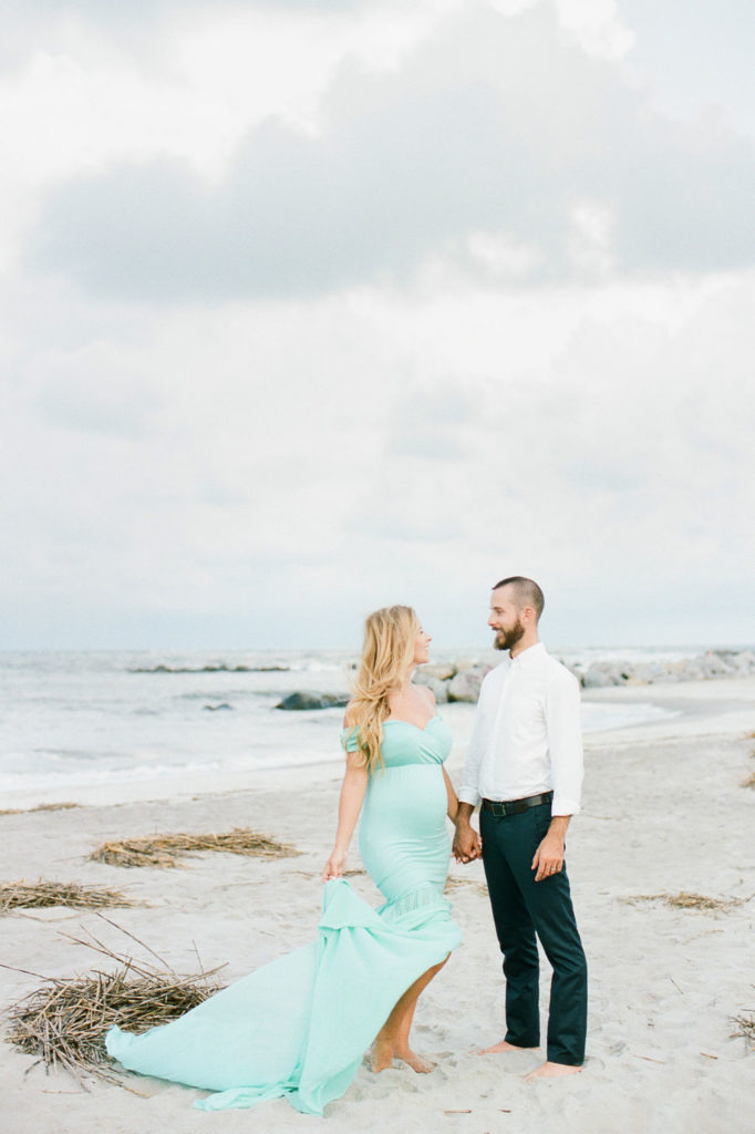
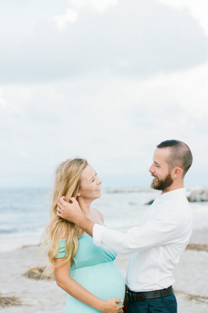
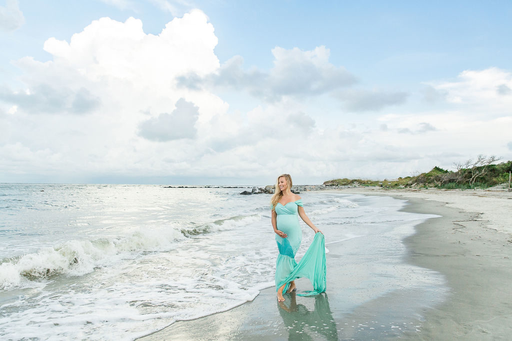
I absolutely love how Jody includes so much interaction between the soon to be parents. It adds emotion to the gallery and pulls you in. I also love that she included my all time favorite portrait image, and one I truly believe every single gallery needs. The far away portrait. Which you can see in the diptych above and to the right.


Overall there are two big things I see missing from this gallery.
One. the lack of diversity in the subjects facial expressions. Every single image is of them looking away from the camera and smiling.
This is a great facial expression to capture, but keep in mind you want to include a wide range of expressions to add more depth to your story and give each of your images a unique feel. I go into more details in ways to add diversity to your gallery’s in my guide “Shooting With Intention“ if this is something you feel like you struggle with.
And Two. The lack of detail shots. Every single session needs to have detail images included in the gallery. Keep in mind you are telling a story with your images. And part of that story is the surroundings. For this particular session I would have loved to see a shot of the water washing up on the sand. A close up/detail shot of the seaweed on the beach. And a shot of the tall grass behind the mama to be (as seen below). These little images make a huge difference in the layout of your session and the depth of the story they tell.

And lastly I’m going to leave you with this.
All the tips I give are ways to elevate your session and create a stronger story. Will they work for every session … no. Jody’s session was stunning and I know her clients will have beautiful heirlooms from it to enjoy for generations to come. But does that mean we shouldn’t stop striving to perfect our craft more? Of course not.
I hope you enjoyed this weeks Lexi Critiques and if you’re ever interested in submitting a session for consideration you can find all the details HERE. Until next time … happy shooting!