VOTE DAILY FOR YOUR FAVORITE 2024 IMAGES!
learn more >>>
VOTING IS GOING ON NOW!
The
END OF THE YEAR AWARDS 2024
Lexi Critiques – Natalie
August 12, 2020
Welcome to another installment of Lexi Critiques!! In case this is your first time here, Lexi Critiques is a little series where I will be looking at a real session from a real photographer in our industry and pointing out strengths and leaving tips that would have made the session stronger. Over the last 8 years I have seen hundreds, if not thousands, of sessions from being a publisher and running my own photography business. I have learned a lot about what makes a session stand out among the rest and I am here to help you achieve just that!
Today we have the talented Natalie Yates who has shared this gorgeous family session with us! And I can not wait to dive into critiquing it for you!!
So with out further ado go grab a pen and paper (for notes) and dive on in below.
* Keep in mind this is a little series and I will not be showing the full gallery that was provided. Each post will include a handful of tips and tricks but know there is a lot more that goes into perfecting a session. I hope these posts help you reach this goal and you are more then welcome (encouraged even) to leave questions in the comments below.
If you are looking to dive more into perfecting your sessions and telling a cohesive story with your images that grab the attention of editors as well as your clients, then check out our guide Shooting With Intention. And use code LEXICRITIQUES to save 30% off for visiting this post!
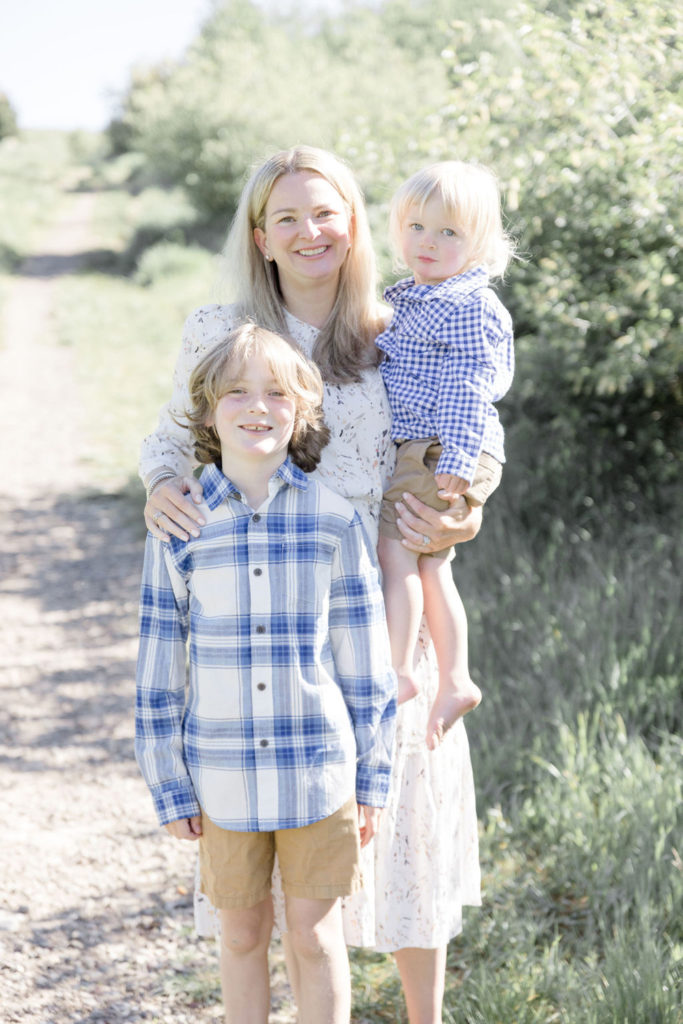
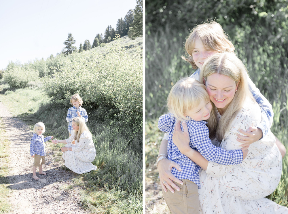
The very first thing I would like to bring up with this critique is portraits. There are 5 types of portrait shots that should be captured during every session which helps gives depth and diversity to the story you are telling. Headshots, 3/4th body shots, full bodyshots, far away portraits, and portrait details. Each and every session needs a good mixture of these and when some are missing you can really feel the flow of the story being hindered.
Natalie did an amazing job of capturing full body shots during this shoot and 3/4th bodyshots. But what was missing was headshots and portrait details. Yes the far away portrait was missing too, but from a publisher’s eye I felt a craving and need for more closer up shots from this session right away. The last image shown above was one of the tightest cropped images in the session, which I would still call a 3/4th body shot. I would have loved to see some headshots and closer up captures of the family interacting, snuggling, and having fun.
Again the diversity in your images is what makes your session a story. And that diversity isn’t just in your crop (like we just talked about) but also in your client’s body language and expressions. Natalie did a great job capturing a wide range of interactions, traditional portraits, and real moments between this family. I didn’t feel like I was looking at any two images that felt too much alike. Often we get stuck in what I call a comfort pose. And this is typically a facial expression and crop that acts as a photographer’s safety net. So they resort back to this often when they don’t know how else to pose or get stuck. This leads to a session where most of the images look similar, when in realty we want all our images to be unique. This was not the case with this session.
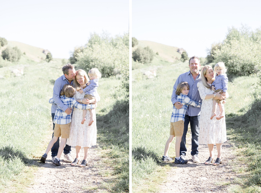
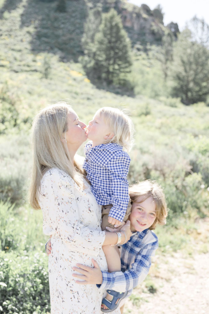
A great way to help achieve this, if you do get stuck in your comfort pose, is to encourage interaction between your clients. Setting up a shot like the one above, while capturing multiple images from the family, or person, interacting with someone or moving helps add depth to your story. As well as helps you capture images that are each unique.
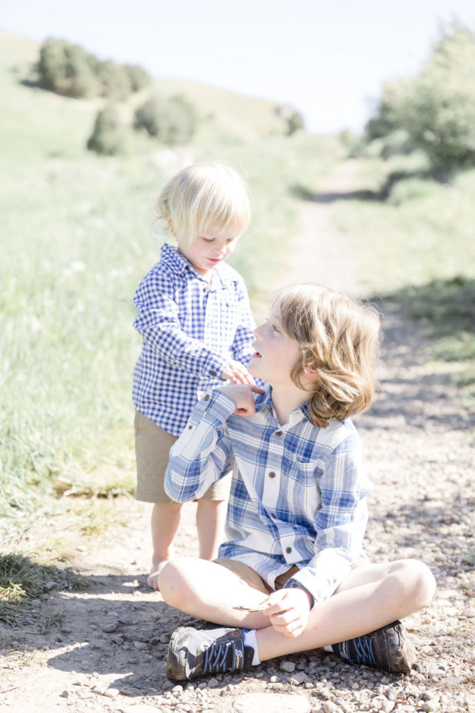
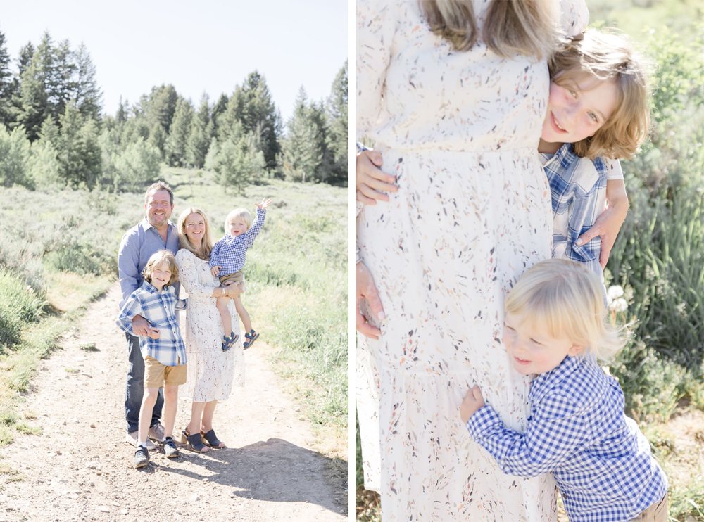
Going back to my topic of portraits. I want you to notice the image above, and to the right. This is the only other image that was cropped tight in this session. See how lovely and happy it looks next to the full body shot. This is a great example of why you want to capture a wide range of portrait shots and why all your images should be unique. If your client is seeing the same image over and over. They are going to pick their favorite and move on. But if each image is unique and works together to tell your client’s story. They are going to want them all. Because they were captured that way. Leading to larger sales and a more diverse gallery. Not to mention this is what publications are looking for as well. A story.
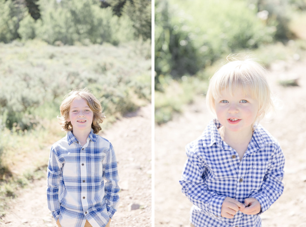
I would like to end on this note. I love how Natalie made sure to capture individual portraits of the children on top of the family. I can’t tell you how many times I have seen family sessions where there are no individual portraits. And where this is fine, you were hired to captured the family as a whole, it’s just a nice extra step as the photographer to capture something the family didn’t even know they wanted. Little ones grow up so fast. I bet this mama’s heart was filled with so much joy when she saw these individual portraits. And that right there can be the difference from just offering a service to offering an experience. Which is something I will talk about at a later time!
Thank you so much for reading through another Lexi Critiques. It’s seriously one of my favorite weekly series I get to do!! If you would like to have Lexi critique one of your session you can submit a session for consideration HERE. Until next time … happy shooting!