A bUNDLE OF thousands of dollars worth of courses, guides, & resources curated specifically to help photographers!!!
ENTER HERE >>>
DOORS OPEN MONDAY MARCH 4TH!!!
THE
CREATIVE
COLLABORATION
Lexi Critiques – Radhika
October 22, 2019
Aww, I am so glad you found your way back to our little blog, and for round II of Lexi Critiques! Are you ready to pick up a few more tips and tricks to make your sessions stronger?
In case this is your first time here, Lexi Critiques is a little bi-monthly series where I will be looking at a real session from a real photographer in our industry and pointing out strengths and leaving tips that would have made the session stronger. Over the last 7 years I have seen hundreds, if not thousands, of sessions from being a publisher and running my own photography business. I have learned a lot about what makes a session stand out among the rest. And I am here to help you achieve that!
Today we have the lovely Radhika who has shared this sweet in home lifestyle shoot with us. (Hi Radhika!!)
So with out further ado go grab a pen and paper (for notes) and dive on in below.
- Keep in mind this is a little series and I will not be showing the full gallery that was provided. Each post will include a handful of tips and tricks but know there is a lot more that goes into perfecting a session. I hope these posts help you reach this goal and you are more then welcome (encouraged even) to leave questions in the comments below.
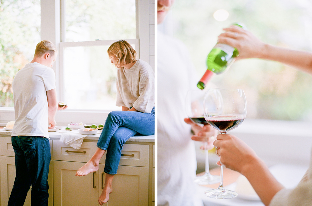
The session starts off with a couple mingling together in a kitchen. They are pouring wine and putting together a dish of some kind. Like I mentioned in our last Lexi Critiques (Which you can see here) it’s important to let your audience know right away what your story is going to be about.
Radhika does this very well in this session. However. Since this gallery was so small I almost felt like a chapter was missing or the beginning of this story.
Who prepped all the food? What are they cooking (this doesn’t become obvious till later)? And how did we jump right into pouring wine?
Not that this session isn’t great, because it is! But it could have added a whole lot more depth to the story if a “beginning” was included.

I get asked a lot about my thoughts on Black & White images. And before I share that I want to remind everyone that my option is not a rule. It’s not what you have to do. It’s an opinion. I am a firm believer that every person is an artist and should create what they want to, no matter what someone else says.
With that out of the way I truly believe that a session should either be all Black & White or all color. When I see random Black & White images in a gallery I feel as though it breaks up the flow of the story. Now I know some images are just dying to be editing in Black & White or a certain part of the story just needs to be edited that way (due to lighting or a request). If this is the case all Black & White images should be grouped together at the end of the gallery.
I will end my thought on Black & White though with one of my biggest pet peeves, which is when galleries include images in both Black & White and color. As an artist it is your job to decide what the final version of an image should be. Not your client. Not a publisher. This doesn’t mean your client can’t ask to see an image in a different version. But you don’t need to supply that for them for every single image.


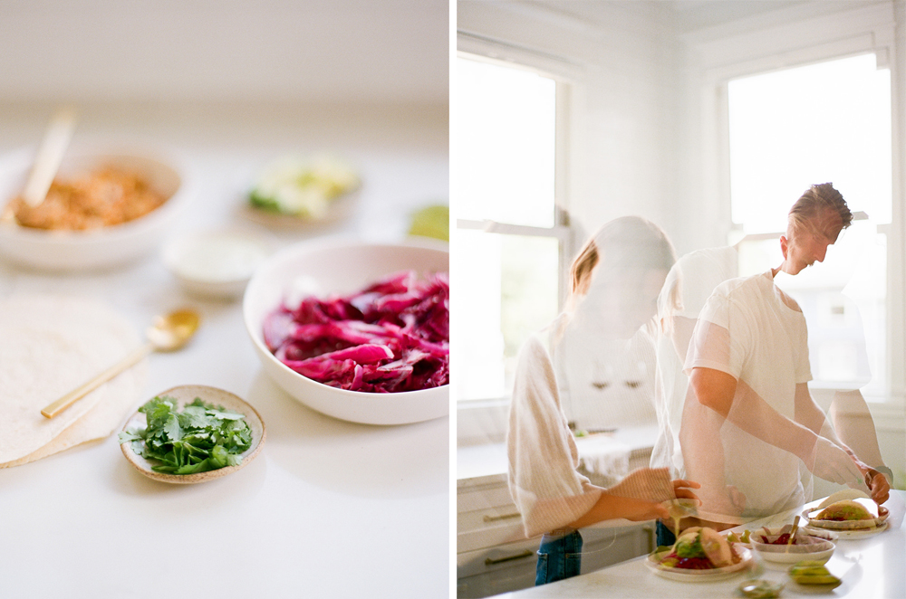
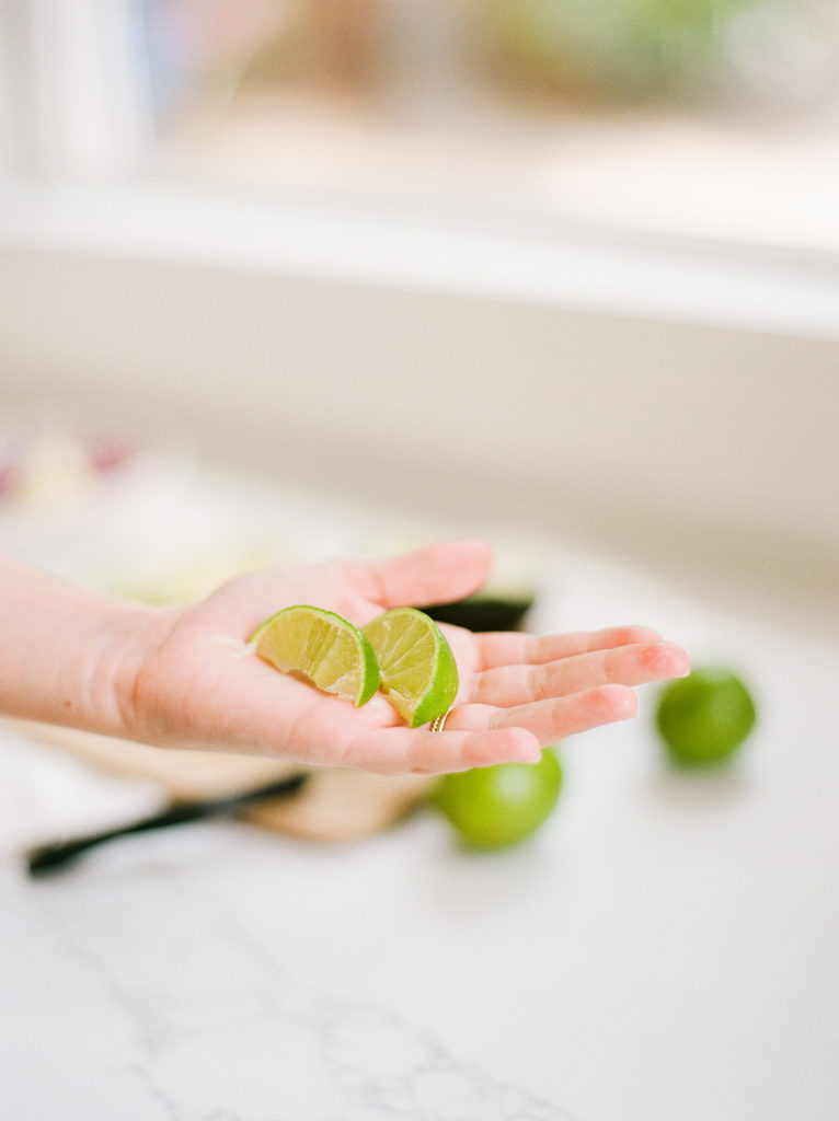


One of the biggest things I see missing from sessions is detail shots. Radhika did an amazing job mixing both portrait and details to tell the story of these two enjoying tacos and wine in their kitchen. Even if you don’t think your session has any details just look around and I bet you will find some.
And lastly I’m going to leave you with this.
All the tips I give are ways to elevate your session and create a stronger story. Will they work for every session … no. Radhika’s session was stunning and I know her clients will have beautiful heirlooms from it to enjoy for generations to come. But does that mean we shouldn’t stop striving to perfect our craft more? Of course not.
I hope you enjoyed this weeks Lexi Critiques and if you’re ever interested in submitting a session for consideration you can find all the details HERE. Until next time … happy shooting!